

Overview:
Customized travel recommendations at your fingertips! With this white-labeled platform hosted by vacation rental properties, guests would input their travel preferences, and property managers would curate recommendations for the guests’ trip.
Objective:
When meeting with the CEOs of this local start-up company, we saw an opportunity to update and digitize their travel recommendations (a pdf file) to a mobile responsive website. This site would be white-labeled and used by vacation rental property managers to curate recommendations for their guests. Overtime, recommendations would improve as well as the guests’ return rate, giving the vacation rental property a competitive edge in the market.
Role & Duration:
1 month, a team of 3 UX designers
Lead Research
Created Persona & Onboarding Process
Usability Testing & Assisted Visuals
Tools & Methods:
Figma, User Research, User Interviews, Market Research, Design Studio, Wireframing, Prototyping, Stakeholder Interviews, Task Flows, Persona Creation, Usability Testing, Comparative Analysis
My Process
Market Research
Locale: a vacation rental property in Texas
In 2020, there are 23,000 Vacation Rental Companies in the U.S
The current growth rate is 6.9%
There are 9 million second homes in the U.S
Lodgeur: a vacation rental property in Texas
25% are rented through property management co.
Each of those companies has on average 100 units
84% of VRC include a printed guidebook within the property
With the market growing so quickly, vacation rental properties are looking for ways to stand out from the competition, thats where Travel Guide comes in.
User Interviews
What are travelers experiencing?
The majority of travelers are using search engines to find recommendations, but user’s tend to get frustrated & overwhelmed with the amount of information on the internet
74% of users start with search engines
81% Gen Z | 74% Millennials | 38% Gen X | 20% Baby Boomers
User’s Frustrations:
“I don’t want to waste any time”
“Too much information on search engines”
“Ratings for tourists, by tourist”
User’s Wants:
“The authentic local experience”
“Personalize trip recommendations”
“Simplified way to save favorites”
Meet Morgan, The Adventure Seeker
Design Inspiration
What are other companies doing?
Can any of these features be applied to our product to solve problems for our users?
Journy: onboarding 3-step process
Utrip: categories and interactive design
Airbnb: design and copy
Cool Cousin: layout and UI
group ideation
Design Studio
The group produced as many ideas as possible in three rounds of 5 mins iterations. We used divergent thinking to brainstorm all possible features for our platform before narrowing in on some key features.
What were the takeaways?
The platform needs to have a map view.
Must have an onboarding for travelers
Fill out your interests in a quick 3-step process
Could have a social feature (an idea for future steps)
Deconstructing the current PDF
I began to organize the information architecture using the current pdf files. My goal was to figure out what features and categories our users needed when traveling.
Update current categories Seeing, Doing, and Eating
Is there a Profile or an Account page?
How many steps to setting up your trip? (what are competitors doing?)
Could have an Itinerary view
Must have a Description view
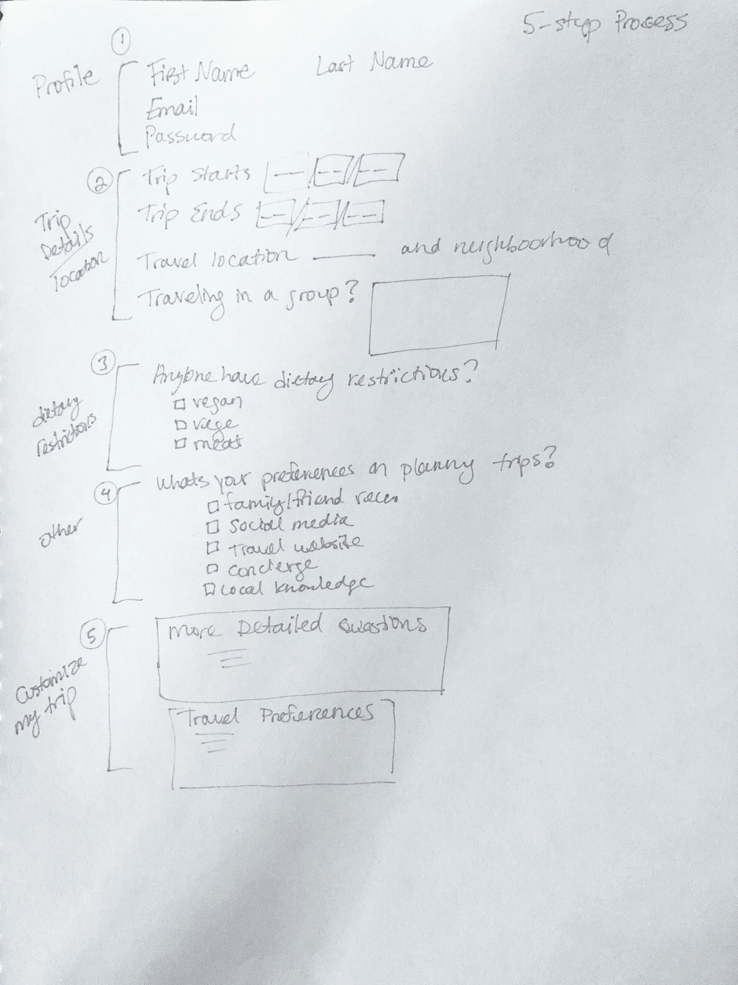


Putting pen to paper, I started with hand sketches and slowly moved into Figma
Low-Fi Wireframes
Onboarding | Recommendations Page | Trips Page


Lessons Learned:
At the beginning stages, we didn’t have a clear direction on the branding of the platform. To prevent this problem in future projects, I would establish a design system in the early stages of the project to align the team on the vision of the brand.
Usability Testing
Before
After
User’s had confusion with the sliders and checkboxes. I consolidated the 2nd and 3rd step to keep it simple and more streamlined
Before
After
Updated the visuals, and added a dropdown feature as to not overwhelm the user when they pick categories
Before
After
I made changes to the navigation based on comparative analysis of Journy and Cool Cousin
The vertical view switched to horizontal view
Change categories in the horizontal view
Adjust the font-weight to show which category is active
Hi-Fi mockups
Morgan goes through the 3-step onboarding process : Login, Details, & Interests
Sign Up page- with the option to sign in through google and facebook
After logging in, this 3-step process makes it quick and easy to get all the information needed to curate there trip.
With a simple dropdown menu, Morgan can select her favorite interests, and not be distracted with too many colors or tabs, something I learned from usability testing.
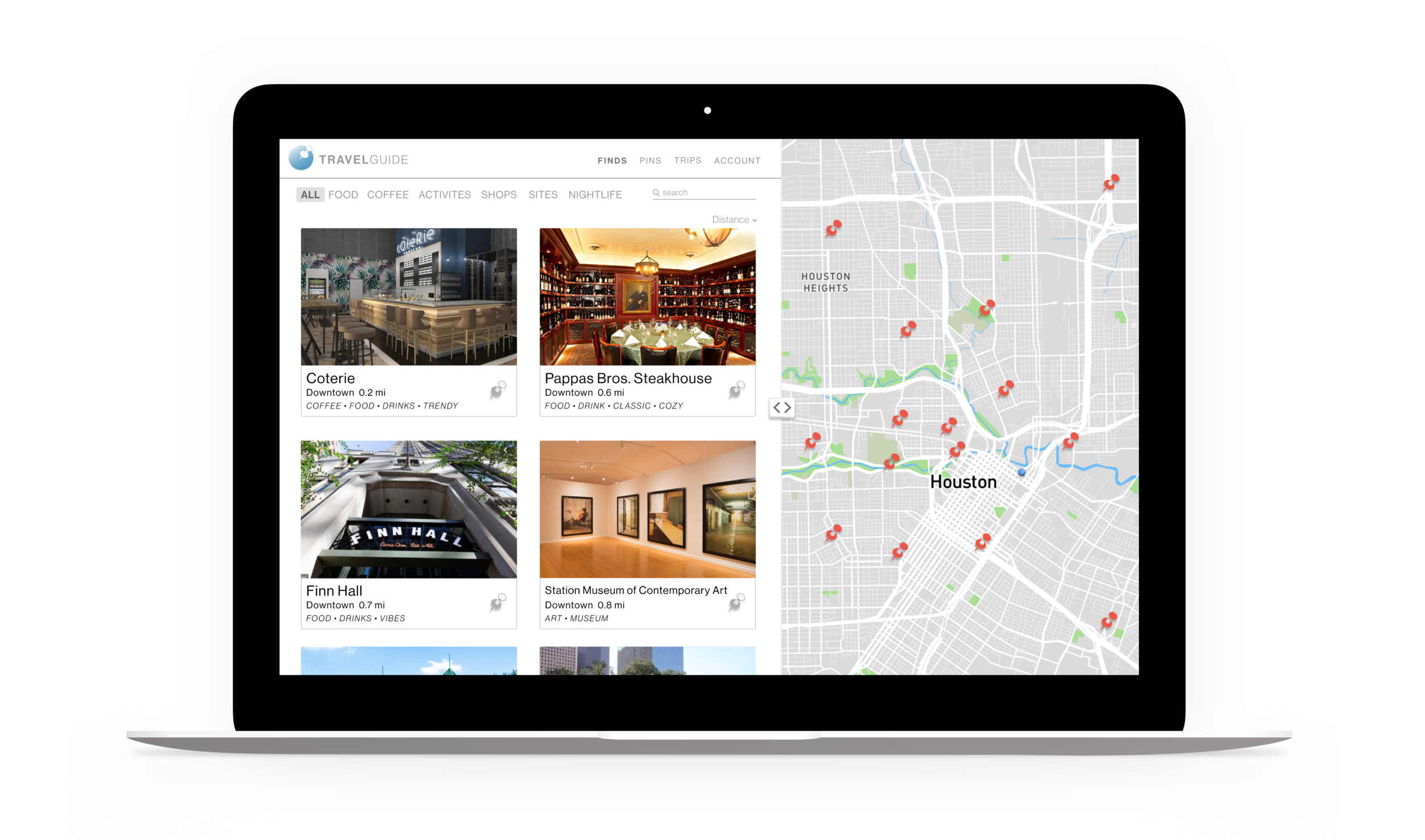
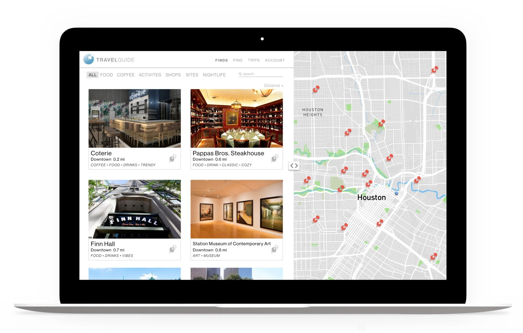
Main recommendations page & description page of Coterie
Main Page view- Morgan can highlight as many tabs as she wants to help narrow her search. She also has the option to “pin” or save her favorite places in the “pins tab” to view later.
Morgan can write a review on the description page to give feedback to the Vacation Rental Co. This will help improve her recommendations over time.
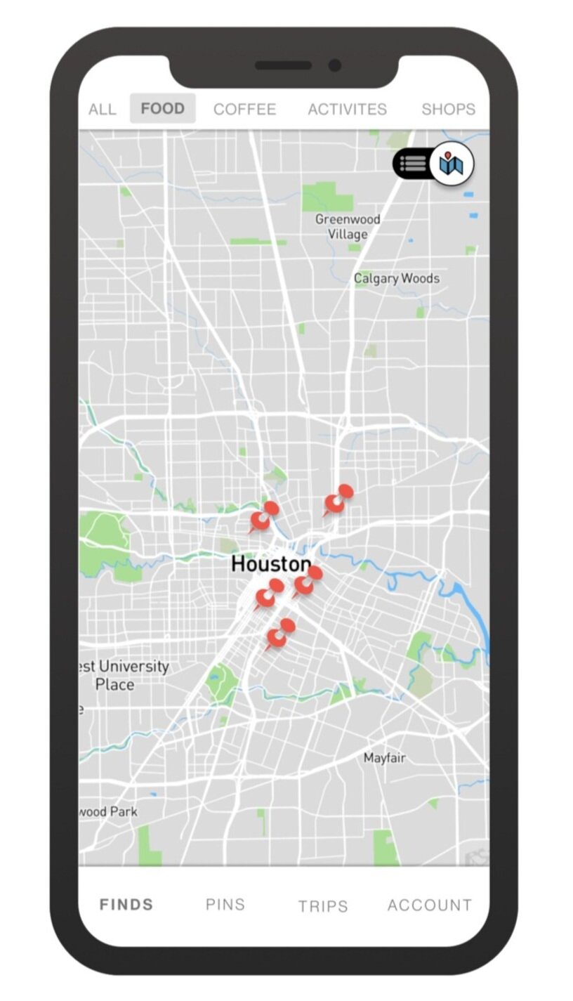
My trips main page & current trip view
My trips page- gives the user a glance at places they are going.
The blue trackers on the map is a way for users to see the route they took, an idea taken from most fitness apps to track distance.
Lessons Learned
Reflection:
I learned about vacation rental property management, and how highly competitive, and rapidly growing this industry is. I was fortunate enough to interview CEOs of local properties and through these conversations, I realized how competitive the market is in 2020 compared to just 5 years ago. This mostly due to the increase of millennials traveling, and the popularity of Airbnb.
By updating the pdf of recommendations to a mobile responsive website we are able to create more personalization for our users like Morgan. Through curated travel recommendations, and providing a review section, rental properties will receive direct feedback from travelers. Overtime recommendations would improve and guest return rate would increase, which gives the property a competitive edge.
Things I would do differently next time:
Have more check-in meetings with our stakeholders to keep aligned on the user’s needs and management needs.
Bring in the stakeholders for a design studio session to see what features they imagined seeing in the prototype.
The process is important:
Throughout this project, I learned a lot about what I value in the creative process. I love to collaborate with other designers. The exchange and bouncing ideas off one another helps everyone to see things from multiple perspectives and can help uncover out-of-the-box ideas that lead to problem-solving.
It’s also important for designers to be objective with their ideas, and remember there is always another idea around the corner. In critical thinking and problem solving it's important to leave our ego aside in the creative process so we can find the best possible solution for our users, the stakeholders, and the business.