
Overview
Terra Toys is a beloved toy store in Austin TX. By taking it online and through the e-commerce experience we will get more people involved with this local treasure.
Role & Duration
2 week concept project
Solo UX designer
Tools & Methods
User Research, User Interviews, Card Sorting, Affinity Mapping, Comparative Analysis, User Flow, Wire framing, Sketch, Prototyping in InVision, and Usability Testing
The Problem
This local toy store hasn’t updated there website to the e-commerce market, missing an opportunity to reach a larger audience.
Solution Overview
By persuading the company to add an e-commerce website they will gain more follows from friends and family out of town. A website is a must for a retail company in the 21st century. Consumers are more and more inclined to shop online, especially during the holidays -- which is prime season for toy stores.

Terra Toys current website
The Process
Research
Who buys online? What are they looking for in an efficient check out process? Do they have any pain points? What are other e-commerce sites doing? Can this inform Terra Toys design?
Wireframing
Starting with a user flow of the checkout process, I began to see the layout of the site, and what pages to include in my design. This included the checkout process, writing a review, and logging in.
Usability Testing
I had three users for usability testing. From those findings I made changes to the checkout process for an efficient and user friendly experience.
Proto-Persona

Laura, The Traveler
Laura Ferguson is 29 and an active traveler. During the holidays, she wants to find a special gift for her niece but may not have time to make a trip to the toy store.
Comparative Analysis
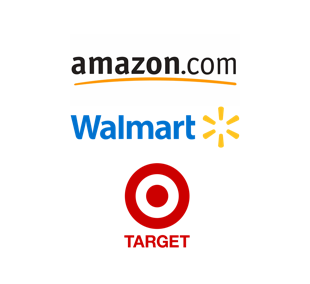
Big Retailers
Amazon, Walmart and Target helped influence the necessary filters, reviews, and carousel view of products.
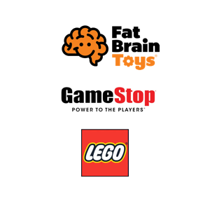
Smaller, Niche Companies
Gamestop (video games), Fat Brain Toys (more educationally based) and Lego informed the structure and layout of Terra Toys. This would be a major influence on my design process given the size similarities to Terra Toys.
Card Sorting
Categories Included: Art, Building Toys, Do It Yourself, Dolls, Games, Musical, Make Believe, Science, Remote Control, Magic, Movement, Plush, Puzzle, Toys with Lights and Outdoor Toys
I had a former Kindergarten teacher categorize Terra Toys current selection. As I watched her sort, I discovered that Terra Toys did a great job categorizing their toys. She recognized which toys were used for educational purposes, which is a current Terra Toys category. She also shops at Fat Brain Toys, which is one of my comparative websites.
Site Mapping
Header
Terra Toys, Profile, Shopping Cart, Search Bar
Sub header
Products, Community, About Us, Gift Certificates
(In later iterations I replaced “Gift Certificates” with “Local Art Gallery)
Footer
Contact Us, Shipping, Gift Certificates
User Flow to Purchase a Toy
A quick an efficient checkout process to purchase a toy, trying to keep the steps to a minimum to accommodate the user.
Wireframing
What features are must haves?
Home page, includes a community picture for hero image
Doll Product Page
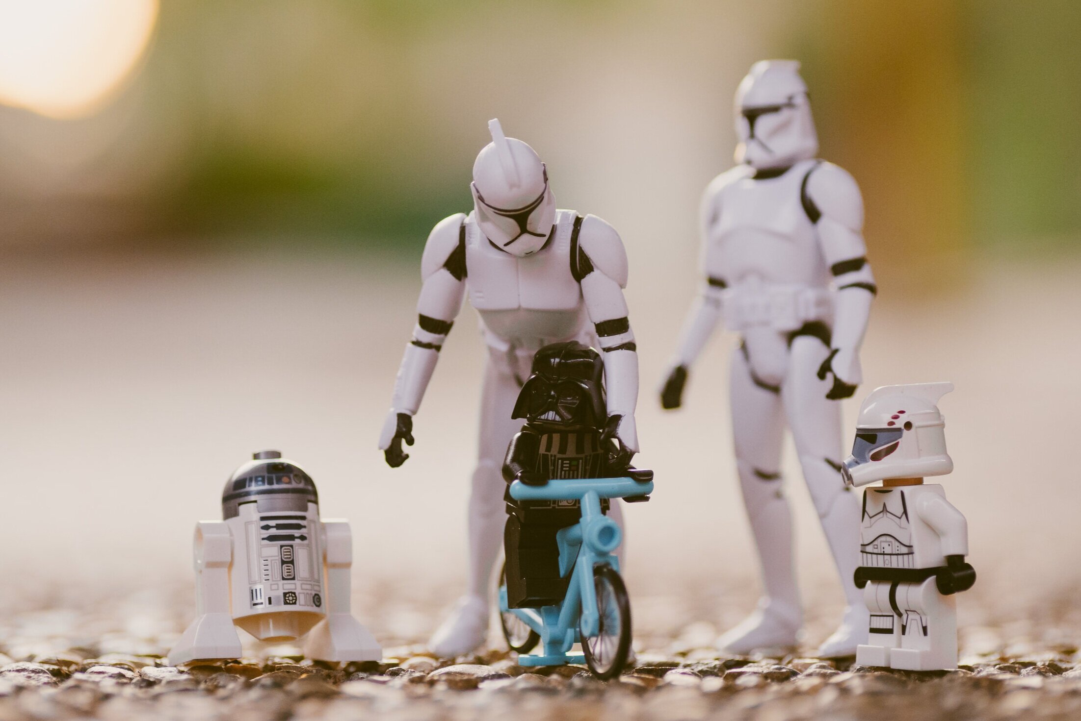
Star Wars Product Page
Check-out Process (try to keep it limited to 4 steps)
Lo-Fi Prototype


Usability Testing
Users were given four tasks:
1) Find the Star Wars barbie doll and purchase it
2) Write a review
3) Find the store hours
4) How would you find a toy under $25
Based on user feedback and time restraints these are the changes I implemented
I moved the review list below the product description.
I put the price point next to the “product name” and added carousel images so you could view multiple angles of the toys.
There was talk about the “About Us” page and the interchangeable nature of “Contact Us” and “About Us”. I decided to research more but left as is for time management.
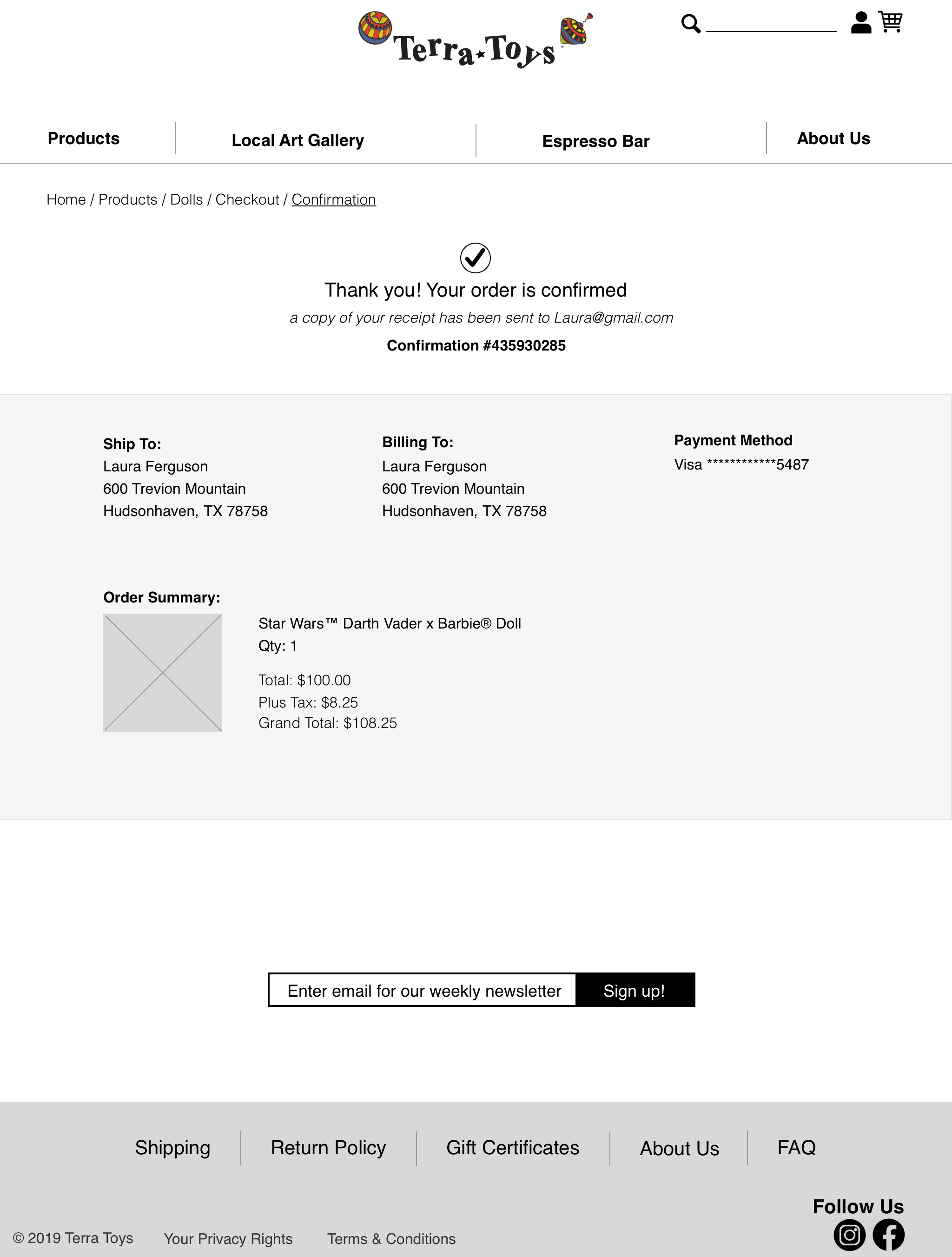
Hi-Fi mockups


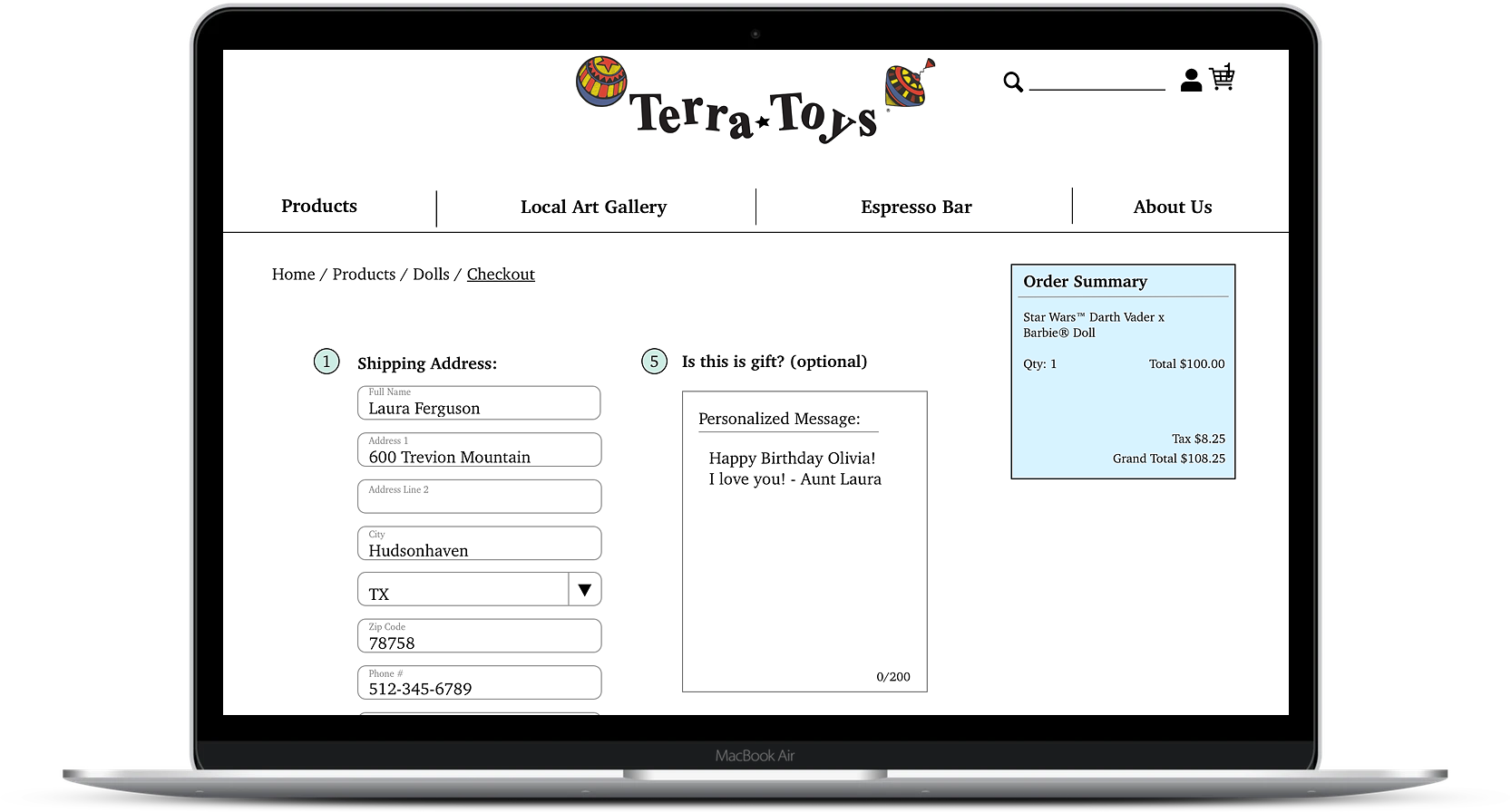


Click to view the checkout process!

Next Steps:
I would love to dive deeper into the Local Art Gallery and Espresso Bar, they are important to the feel and aesthetic of the store so I want to find a way to display them in a way that encourages user’s to come into the store and feel a part of our community. I would also love to add a “sales!” tab on the top right corner, to increase engagement.
Lessons Learned
Reflection:
I realized about halfway through the project that I was having a hard time coming up with ideas early on because I’m not a frequent online shopper. I quickly made use of my resources and asked friends and family about their behaviors and why they are motivated to shop online. Finding out there frustrations and happy paths, helped me to get into the mindset of the user.