

Overview:
My interests in mental health, psychology, and parenting lead me to this project. The founder of the companies set a goal for the team to produce an MVP mobile app service that would help parents build healthy relationships with their children. The team included 9 members with specialities including UI/UX designer, Content, Visual Designer, Data Science, and Product Manager.
Role & Duration:
UI/UX Designer with focus on Research
11 week internship
Methods:
Agile method (weekly sprints), card sorting activity, empathy mapping, wrote scripts for qualitative interview over zoom, quantitative surveys, affinity mapping, storyboard testing, building personas, low-fi to hi-fi prototyping in Figma
Our Process: The big picture
User research was held in weekly sprints for Phase 1-8. Each week I scheduled parents for interviews/testing features. Due to the time constraints and conditions of COVID-19, all interviews were done in 30 minutes over Zoom. Wireframes, script writing, and prototyping were built in 3 days, testing was done at the end of the week. From phase 4-8 we iterated on low-fi wireframes and made changes to the prototype based on user feedback. In total I interviewed 27 users over the course of 11 weeks.
User Research: Phases 1-8

Weekly Schedule for Phase 4-8
Monday-Tuesday: Build wireframes, connect prototype in Figma, write the script, and hand over for team review.
Wednesday: Finish changes based on team feedback
Thursday-Friday: Interviewing and testing features, synthesizing notes
Method for qualitative interviews & testing
Each week I held 30 minute sessions by starting the conversation with an introduction explaining the company goals with the app. Followed by an ice breaker to get the parent comfortable talking about some of the challenges they face. Then, the exercise for that week.
Lessons Learned:
By the end of phase 6, I learned by focusing on 1 feature to test, saved us time with users, and gave the UX team richer data to synthesize and improve MVP features.
Parent/Expert Need Finding
Research began with empathy. In the first 2 weeks, we found needs, wants, and prevalent pain points from users. We collectively held over 11 interviews. I sent out quantitative surveys to find our target user, and interviewed 5 parents and 2 experts to find common pain points and frustrations of parenting.
Who I interviewed:
Using divergent thinking we interviewed a broad selection of individuals to help broaden our perspective of the parent-child relationship.
Students
School teachers
Principals
Guidance Counselors
*The team presented their individual work, and from our research we were about to Affinity map common pain points.
Due to the sensitive nature of the material, I am unable to show deliverables.
Card Sorting Activity
Based on our quantitative survey and phase 1 research findings, I had users rank these pain points/frustrations from most to less prevalent.
Why I chose a card sorting activity
After our affinity map, we saw 15-20 pain points. I had parents perform a closed card sorting to narrow down to the top 5 most common frustrations.
After each sprint I collected data from interviews and sent a list of topics to the content team. This helped our collaboration between UX and Content.

(Due to sensitive nature, topics are blurred out) P1-P7 = Parent (user)
Crazy 8’s team collaboration
Gathering ideas from phase 2 research, we brainstormed on possible features for our users.
Ideas included:
Match with a parenting coach/expert
Journal entry submission to their coach
Parenting courses - to join a parenting community
A list of parenting topic recommendations
Calendar check-in’s with your coach
*Based on the business needs and needs of our users, our stakeholders made the decision to focus on building a coach chat feature & bite-sized content for the MVP.
Storyboard Interviews
Before I started building wireframes, I tested our hypothesis to see if parents would use our coaching service
(Some sensitive information has been blurred out)
Questions from the interview:
What the first thing that comes to mind when you see this scenario?
What type of content would you want to see here?
What would you expect from a coach/expert?
What qualifications are important to you?
What I learned from the storyboard scenario:
This scenario is common, either with their own child and other friends who are parents.
User’s want a coach they can trust and feel connected with.
User’s want activities with guided support from a coach to keep them accountable through SMS messaging.
Lesson Learned:
Storyboarding can help designers identify features or areas we that we may not have considered before. By leaving the story open to interpretation we invite users to help shape and guide the direction of the product.
Low-Fi Wireframes
Asking questions about each feature would inform the navigation and home screen display.


Questions from the interview:
What did the user expect to see here?
Any important topics we missed?
What do you like about this community feature?
What’s most important to you when chatting with a coach?
How users responded to each feature:
Users prefer to search or read articles first before reaching out to coaches.
User's like having the SMS option to chat with their coach.
User’s really responded to the community feature. Other resources such as Facebook parenting groups tend to lack organization, and are not always helpful.
Looking Back:
I struggled with feature blot in the early stages of low-fi wireframes. I found myself trying to fix too many problems and thats when I realized that as a designer it’s about balancing both business needs and needs of the user. By focusing in on key features, and creating a parking lot for future development, we were able to stay on time for our deadline.
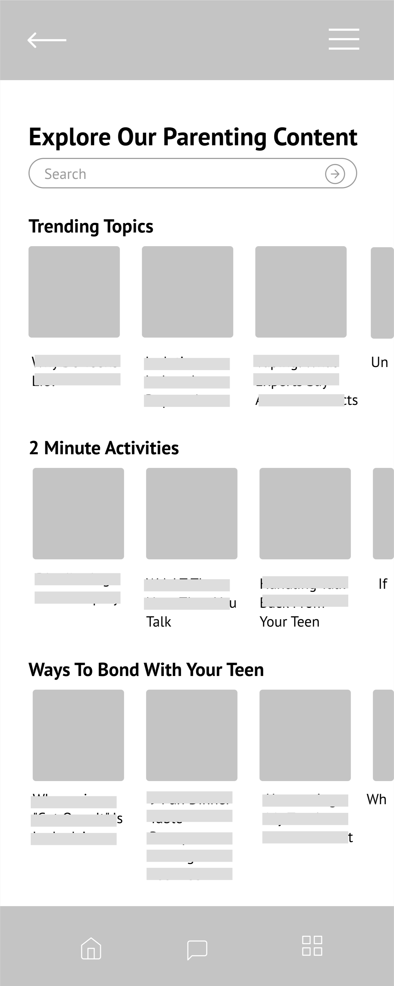
Onboarding
I collaborated with the data team to learn more about algorithms. This will sort the content for the users specific parenting needs.
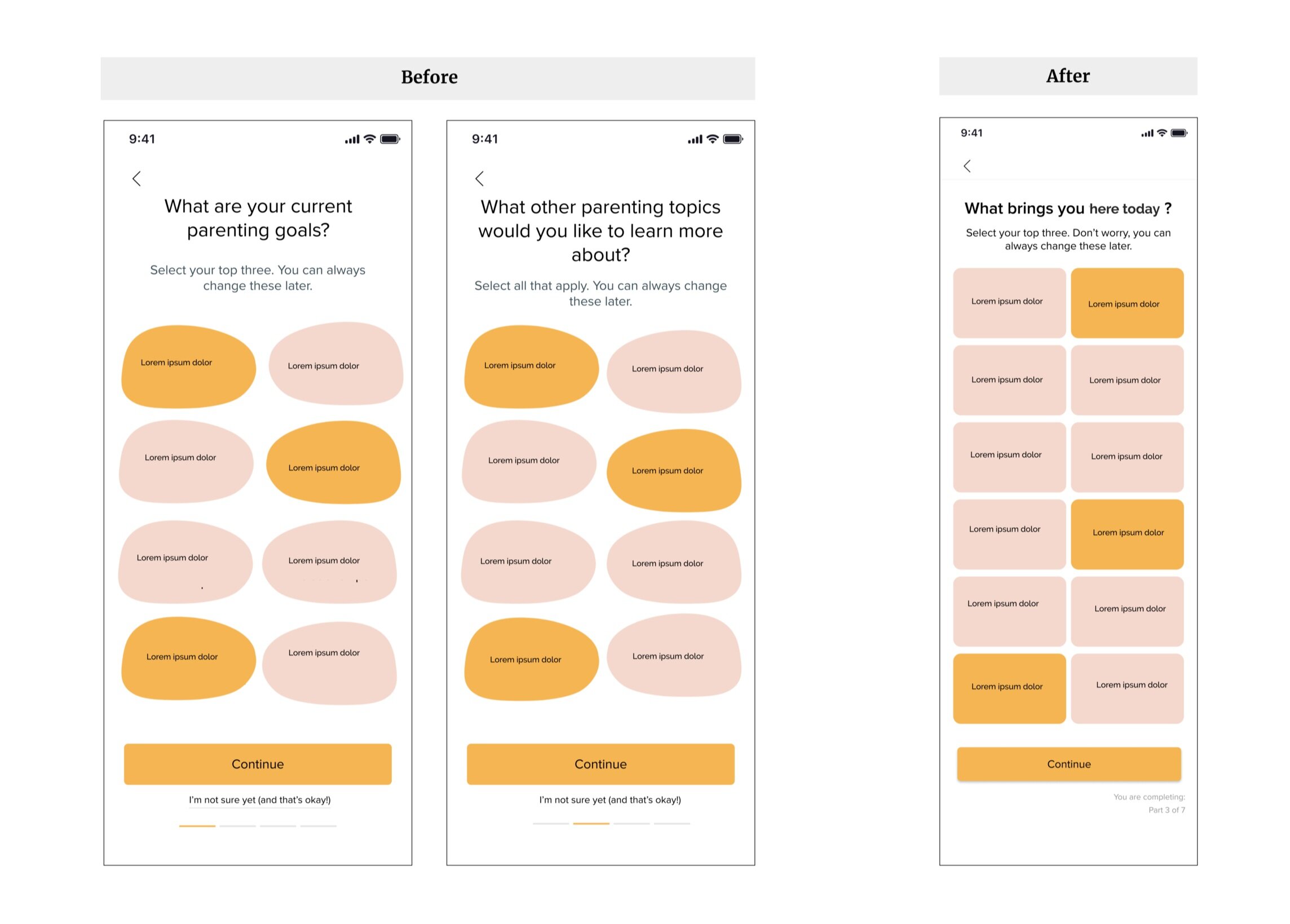
Onboarding was a challenge because we needed to ask specific questions about the challenges of parenting in order to help tailor the users content, but given this was the first time seeing this new app, we knew we needed to use friendly copy to gain their trust and encourage them to sign up.
What brought the user to this platform?
What does there household look like?
Do these parenting topics interest the user to continue on?
The responses from users helped us narrow down to a quick 9 screen onboarding process.
Learning moment:
The parenting goals/content screens were messy in the beginning. Users were unclear about what we were asking the two screens felt repetitive. Through testing, I condensed these screens to one asking a more generic question of what brought them here. This was well received from users.
MVP Features
By testing features with storyboarding early on, we were able to spend more time on developing more content, activities and onboarding features
Learnings:
Users really enjoyed the goal oriented activities, so we used this opportunity to dig a little deeper on what kinds of activities they would want to see. All data from these interviews I would synthesis in a report for the content team.
Some user were stuck on activities, so to help with the learning curve, I changed the user flow to have access to a coach during the activity.
evolution of the home page view
Each sprint I asked users “whats the first thing you want to click on”. Based on their answers, over time I was able to build content they wanted to see immediately.
Changes made after testing:
I updated articles from horizontal to a list view to give more information about article read time and bookmark option for the user.
The CTA to view coaches was moved from bottom to top, for those who need or want immediate assistance.
At one point I considered a chatbot icon on the home screen, however, after testing I realized parents either wanted to view articles or chat with a coach so I changed the user flow to go directly to view the coach page. From here users had the choice between coaches or a chatbot.
Future Steps
Community Feature
The community feature was high in demand, but because this project was in the early stages we didn’t have enough users signed up for our launch date. We put a CTA on the landing page to “join our community” and created a tab on the navigation bar for future development.
Lessons Learned
Don’t reinvent the wheel
In the early stages of low-fi wireframing, I realized I wasn’t utilizing my UX resources enough. I could have saved more time if I would have looked at what competitors were doing on their service to see if anything could be applied to our MVP.
Focus on one feature at a time for testing
Due to COVID-19, there was limited time to interview parents. Since interviews had to be 30 minutes max, focusing on one feature per sprint I was able to get more valuable data and also make decisions quicker. This is how I came up with the idea for the chatbot in the chat feature. I realized a coach wasn’t always going to be available and a user might need assistance right away. Adding this to the feature helped to round out the service and give value to users.
Gathering recruitments take times
Finding users to interview took more time and organization than we realized. For the next round of research, I would recommend appointing one teammate to gather leads and schedule. This will free up time for UX to focus on writing scripts and building wireframes and testing.
Collaboration is key
As a designer, I love to talk through my ideas with other teammates. I really appreciated my 1:1’s with other disciplines. Getting to see what they were up to on a weekly basis helped me step outside my work for that week and see the bigger picture.